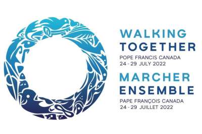
The official logo of the Pope’s visit to Canada was released. The logo of the visit from 24 to 30 July was designed by indigenous graphic artist Shaun Vincent.
“My creative process is inspired by nature, particularly in my family’s land in St. Laurent, Manitoba, a Métis community where I ground myself and am reminded where and who I come from – often with a dose of humility and always good humour.” -Shaun Vicent
Owner of Winnipeg-based company Vincent Design, Shaun was hired by the visiting team in early 2022. After a long discernment, talking with elders and family members, he made the decision to participate in creating the visuals for Pope Francis’ historic visit to Canada.
“For this logo, the community is at the centre of what I wanted to portray, with the reindeer and herds of bison, the fish and eagles, with a dove of peace and the keys of St Peter representing the Holy Spirit and the Pope – placed amongst the animals and elements of earth, sky and water. Wherever we go on this journey of healing and reconciliation, we go together,” explained Shaun Vincent.
In explaining why the logo is circular, Shaun Vincent emphasises that “to really walk together for purpose requires direction and focus. A circle-shaped grandfather drum gives rhythm to the dance circles. Circles of flowered beads sparkle during the violinist’s melody. A circle of arms outstretched while throat singing under the circle of the sun. The circle can be found everywhere in Indigenous life. In a circle, all are equal, all are visible. The ceremony needs this symbol. It is history, it holds our stories. It is who we are. A symbol to represent this event must have trust and calm at its centre. That’s why I chose this symbol as its core, with the teachings existing within its shape.”
Since it was presented, the design has elicited glowing reviews. “We are very pleased with the work of Shaun Vincent and his team,” said Jasmin Lemieux Lefebvre, digital communications lead for the papal visit team.
Jasmin Lemieux Lefebvre further stated, “We are grateful that Shaun was able to bring his creative vision to life and incorporate so many important elements into the logo. This important visual is a powerful symbol of our ongoing healing and reconciliation journey.”


