



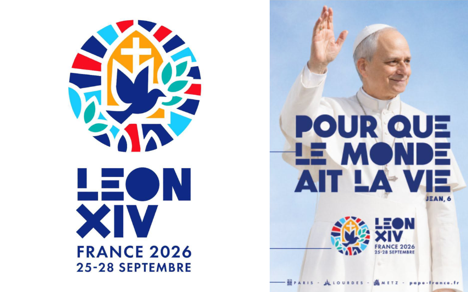
The French Bishops’ Conference has unveiled the official logo for Pope Leo XIV’s visit to France, scheduled for September 25–28, 2026. The design is rich in symbolism and was created to reflect the journey’s motto: “That the world may have life” (cf. John 6).The modern artwork seeks to express peace, the Eucharist, the heritage of French cathedrals, and Art Deco, one of France’s most representative artistic movements. It was created by Atelier Argo, a French studio specializing in design and brand identity. Its founder, Ghislain d’Orglandes, explained the creative process behind the logo, typography, and graphic elements.On its social media accounts, the Episcopal Conference described it as “a powerful symbol that combines the dove of peace, the vibrancy of life, and the spirit of the rose windows of our cathedrals.” They also noted that “the tricolor of France blends with the orange of life and the green of hope, creating a resolutely joyful and bright universe.”
“When the French Episcopal Conference came to present the project to me, they did so with the phrase that the Pope chose to express the meaning of his trip and his visit. I observed it carefully and wanted to get to the heart of it,” d’Orglandes explained.
“That’s where the idea of the dove with an olive branch, a symbol of the return to life, came from. I started with that first sketch and then worked on the Pope’s name as if it were a logo. It’s a short name, easy to remember. Those four letters, along with the Roman numeral, already formed a very strong image,” he said.The result is a circular emblem reminiscent of a cathedral stained-glass window. Inside appears a blue dove, a cross, an architectural form that evokes both a church and an open door, and an olive branch.
Regarding the meaning of the symbols, the designer explained: “The dove naturally represents peace; the branch symbolizes the sprouting of life, rebirth. At the same time, the whole adopts a stained-glass style, like a large rose window that evokes both Notre Dame and those of the great cathedrals.”In addition to the main logo, the accompanying images include minimalist illustrations of three emblematic locations from the papal trip: Paris, Lourdes, and Metz.
As part of the project, Atelier Argo also developed an original typeface “following the same line as the logo.”“It conveys stability and a timeless character, but at the same time it has curves and a certain softness in its horizontal and vertical lines. They are letters with a strong presence, with full forms that can symbolize the Eucharist, because the Eucharist is fullness,” said d’Orglandes.